BeeBold is a growing online lip balm brand with a focus on naturally formulated lip care. The Brand's tone is very warm, relatable, empowering but also playful. It focuses on encouraging a more natural approach to skincare and wellness.
Project Goals
The project centers on building a full design system that feels fresh and consistent across every touchpoint. Something more energetic, bubbly, and modern that actually grabs attention on the shelves and makes people want to pick it up.
Deliverables
Logo Design
Social Media presence
Retail display
Print advertisement
Creative Process
Brand Research
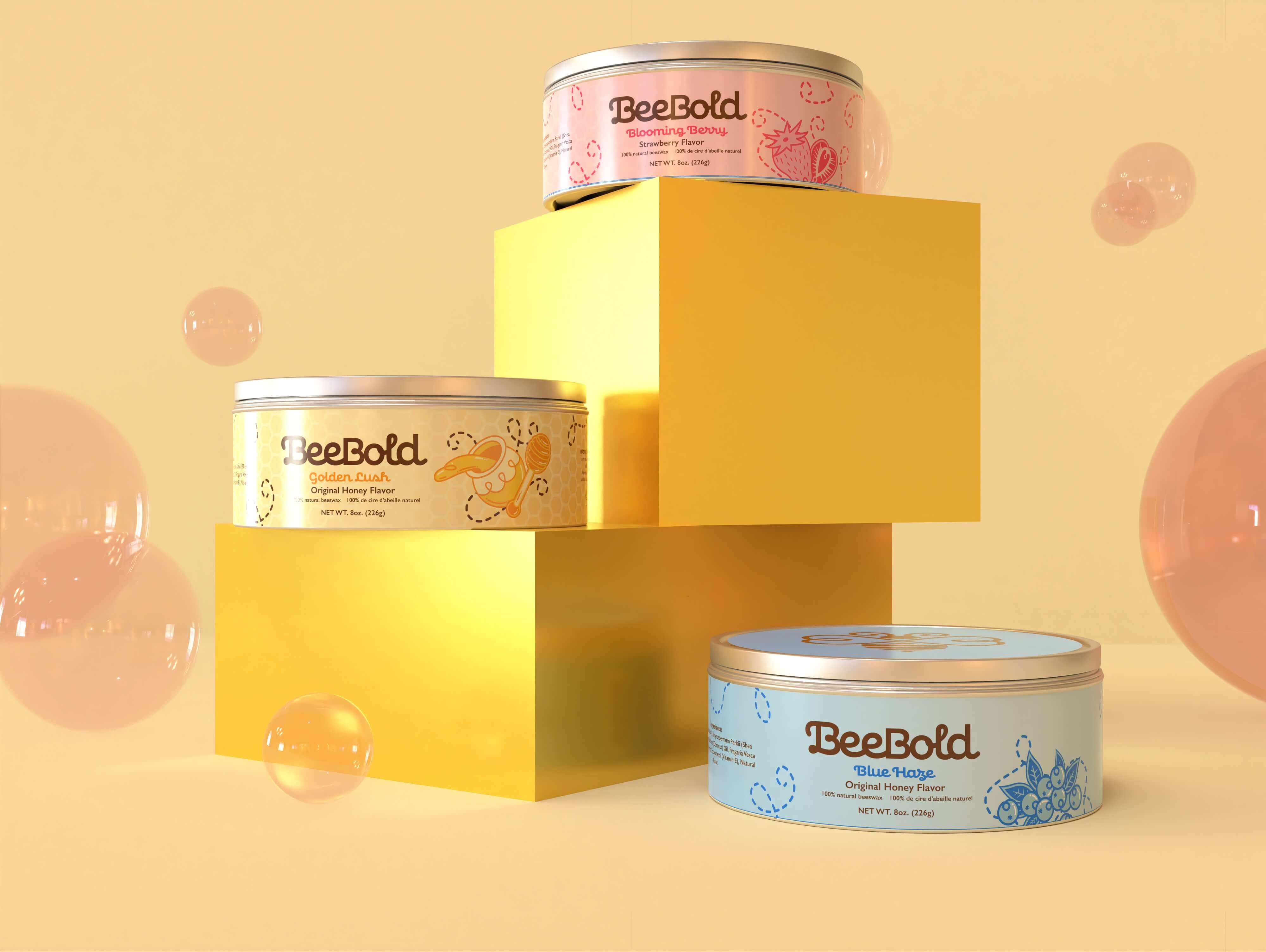
The main issue with BeeBold isn’t the product, it’s it unremarkable and plain branding. The lip balm itself has an effective and playful gimmick but is not backed properly by the company’s branding. The current look feels flat, uninspired, and wouldn't stand out much in a competitive retail environment.
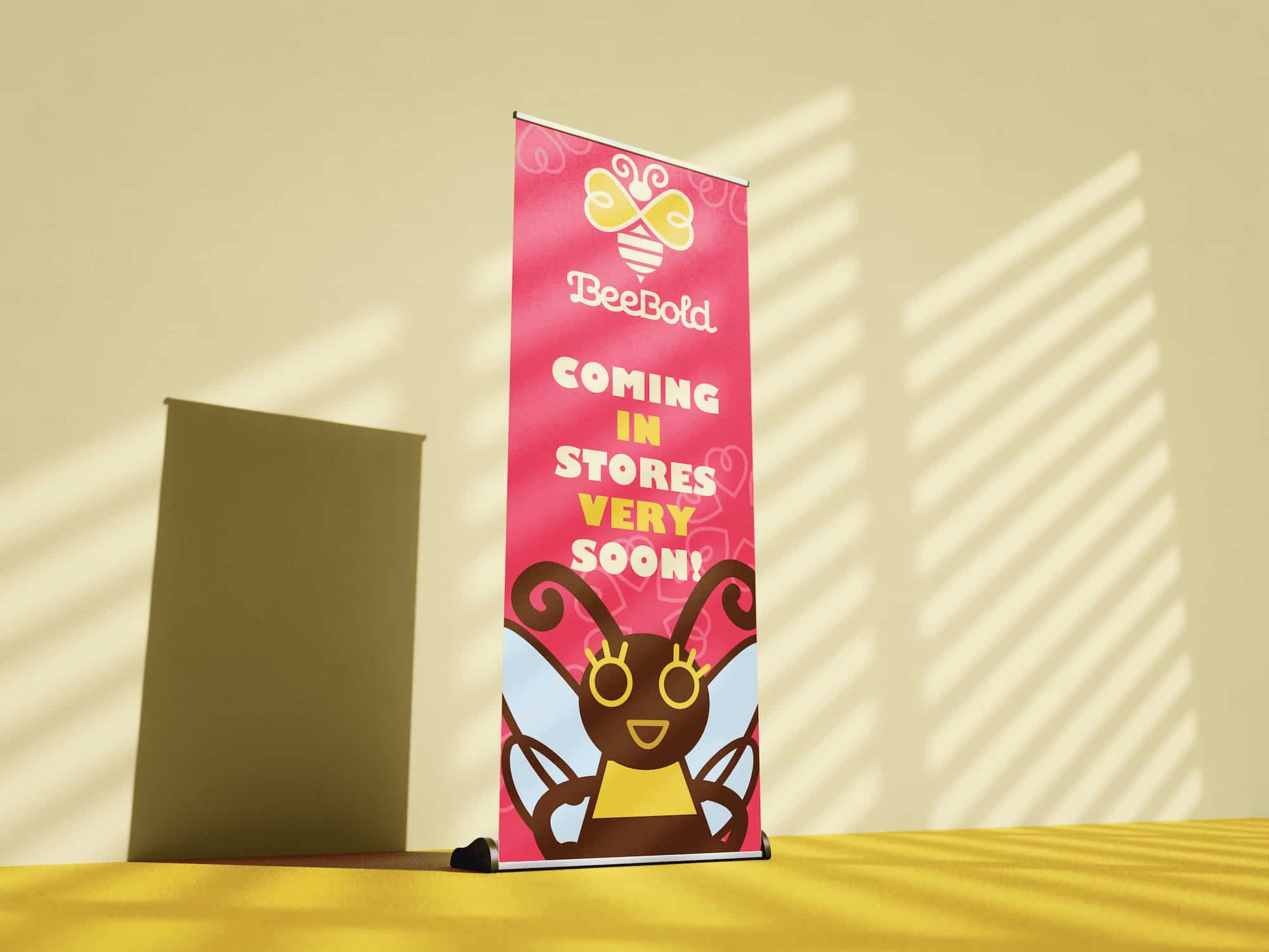
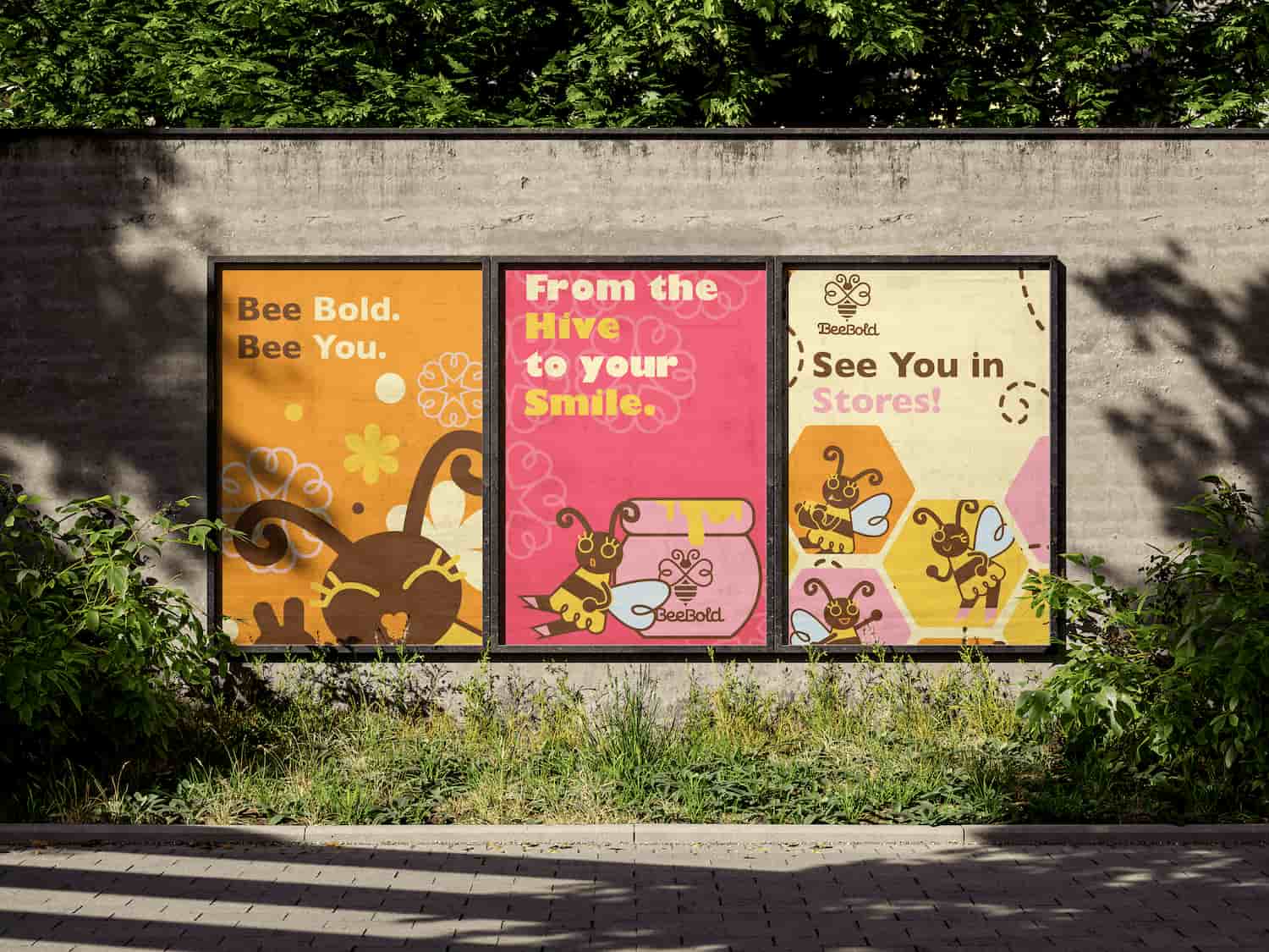
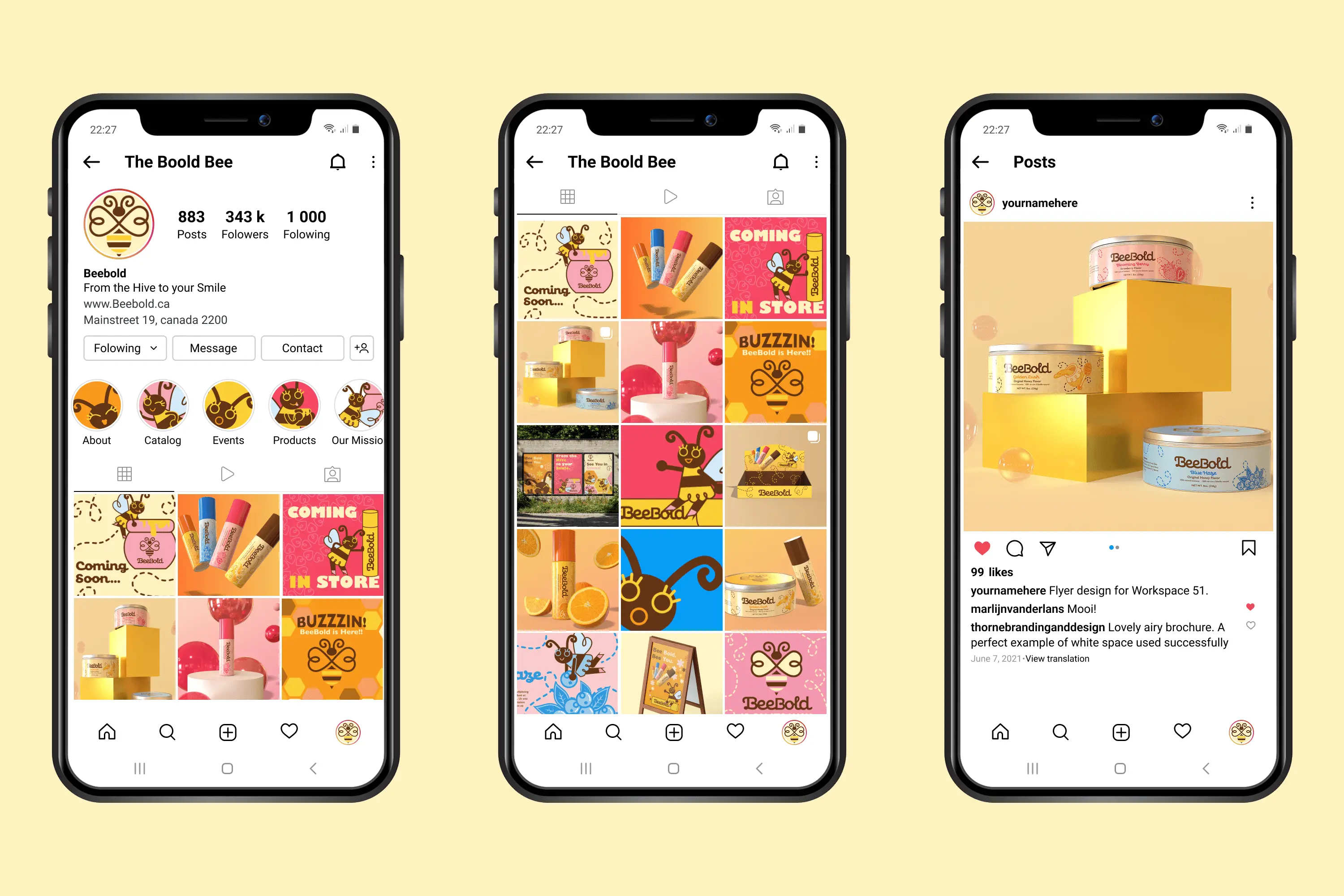
Now that the brand plans to launch in stores, a rebrand is necessary to gives Beebold the confidence and visual spark it needs to finally stand out in shelves fun, modern, and ready to connect with today’s shoppers
Logo construction
The Logo of the brand represents a honey bee with its prominent wings facing the viewer. It is connected to the core of the brand’s identity in its use of beeswax as a primary ingredient to their lip balm formula.
The symbol makes use of soft curves and a mix of fill and outlines, its roundness is well complimented by Confiteria, the decorative typeface it is paired with.
Graphics and Mascot
To strengthen the New Branding system, It was crucial to me to come up with Graphics that would compliment and spice up the rest of the Branding.
The first graphic element is a Mascot named Beeatrice that perfectly incapsulates the fun, bold and bubbly energy of the new branding. Next graphic elements I made were patterns, each using symbols associated with bees and the logo itself.
Lastly, I made illustrations for 4 lip balm flavor, each one matching the flat and bright style of the Branding.
Refinements
Now that I had all of the necessary elements for my branding system, I had now to apply different combinations of those elements to my deliverables.
I started by experimenting with different format and layout options, then adjusted my colour palette, created die-lines for my product designs and finished by applying the results to mockups and 3D models.
Final Branding
The final rebranding of BeeBold is an improvement to the bareness of the original branding. This new visual identity brings a fresh and eye-catching energy that would stand out in a retail environment.
From the colour palette to the typography and visual elements, Beebold is an authentic brand that do not shy away from its Boldness and playfulness. It's a refreshing take on Natural lip care, organic yet fun.
Key Takeaway
This project influenced the way I approach designing a system, by putting an accent on variety, experimentation and balance of text and graphics.